
 Workflow Step 1: Writing your Manuscript
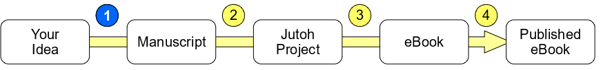
In Installing Jutoh on WIndows, I outlined the 4-step process of creating an eBook: Write your manuscript, Import it into Jutoh, generate the eBook files, and publish those files to Amazon’s Kindle Direct Publishing, Barnes & Noble’s Nook Press, Apple’s iBook Authors, and other electronic and print distributors. This page covers step 1: writing your manuscript so that it will be easy for you to import it into Jutoh.
Many eBook formats are based on HTML and CSS: the Standards that make web pages automatically adapt to so many different devices. Regardless of which word processor or formatting application you use to create eBooks, you can make your eBook formatting process a lot easier by following the basic HTML/CSS rule of separating content (the text and its structure) from presentation (the look of that text on the eBook reader’s screen).
The idea behind this rule is that each block of text should include the name of its particular function, or Style, such as “Header 1”, “Quote”, or “Caption” – without saying anything about how to display text in that Style. A separate set of information (the Style Sheet) tells the web browser or an eBook reading device how to display that text, such as “Display Header 1 text in boldface 16-point Arial font”. This one simple rule has several consequences when you write your manuscript. The list of Do’s and Don’ts below cover those consequences as well as other manuscript-writing tips that will make your work with Jutoh much easier.
Text Do’s
Do use Styles rather than ad-hoc font, size, spacing, and color changes
If you remember only one rule, remember this one, because it will save you hours of tedious reformatting later. Find how your word processor represents Styles, and always use Styles rather than manually (ad-hoc) changing a paragraph’s font, font-size, or color. For example, in creating a chapter title, do use the Chapter Title Style (likely named Header 1 or such); do NOT manually adjust the font and font-size to make your chapter titles stand out. The figures below illustrates these two approaches in LibreOffice:
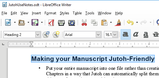
Notice that the figure above (the Do figure) shows a chapter title that uses the Style named “Heading 2”. Notice also that the Font happens to be Arial and the font size happens to be 16.1. I changed the text from a normal paragraph to a chapter title by changing the Style selection from Text Body to Header 1. This is what Jutoh expects.
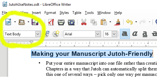
Now look at this figure (the Do NOT figure). The text of the chapter title looks the same, but the look hides a subtle and crazy-making difference: the Style of this chapter title is Text Body: the same Style used by normal text in the manuscript. I’ve (incorrectly) changed the text to a chapter title by manually changing the font to Arial and the font size to 16. The crazy-making part is this: because Jutoh formats each manuscript paragraph based on the Style rather than the ad-hoc font and font size, it can’t know that you meant your large, Arial text to be a chapter title. It will think your whole manuscript contains just one, huge chapter.
Another way to think of this guideline: when writing your manuscript, act as if the font, font size, and other paragraph-formatting controls don’t exist. Always use only the Style to change the appearance of text.
If you have a manuscript that you wrote using ad-hoc changes in font, font size, line spacing, and color, don’t give up: you’ll need to go through your manuscript, find every ad-hoc appearance change, and correct it by correcting the Style of the affected text.
If you have more Styles than the word processor supports by default, don’t worry: just create a custom Style for each of those unusual types of text. For example, if you’re writing user manuals for electronics, you might want to create a “Warning” Style, which uses Bold text in Red.
The one exception to this “Always use Styles” rule is Bold and Italic text. If you want to emphasize a small amount of text in a paragraph, just use the Bold or Italic buttons rather than creating a Bold or Italic Style.
Do use only Normal, Bold, and Italic text types
Don’t use other text-formatting types such as Underline, Strikethrough, Shadow, Superscript, and Subscript, because not all eBook reading devices can display those text types. If you want your eBook to look good on as many devices as possible (and who doesn’t), use only Normal, Bold, and Italic text.
Do use only one space between sentences
You’re probably used to writing sentences with 2 spaces after the period, question mark, or exclamation mark. Instead, in the web-influenced world of eBooks, you should put only 1 space after the period, etc. between sentences. Jutoh will automatically add the missing space in the eBooks it generates.If you have already written a manuscript with 2 spaces after each sentence, don’t worry: you can either edit your manuscript, replacing 2 spaces with 1 space, or you can use Jutoh to fix the problem using its Document Cleanup feature. I’ll explain that feature in detail in a future page.
Do use the Style “Header 1” for each Chapter title
Using the same Style for each Chapter title lets Jutoh know where the chapter breaks are, and if you like, lets it construct an automatic Table of Contents. If you really want to, you can consistently use a chapter title Style other than Header 1; if you do, you’ll need to tell Jutoh what this chapter title Style is when you Import your manuscript into Jutoh. Jutoh supports 4 different ways to mark your Chapter titles in your manuscript, but I prefer using the Header 1 Style because it’s Jutoh’s default. The Jutoh Manual describes all the details.
Do write your manuscript as a single document
That is, as a single Word, LibreOffice, etc. file. Some eBook formatters recommend splitting your manuscript into one file per chapter. In contrast, Jutoh works best when importing your manuscript from a single file. Although Jutoh supports importing a manuscript from a series of files, it seems to support that type of import only for raw text (.txt) files rather than LibreOffice .odt files, Word .docx files, etc.
Text Don’ts
Don’t put page breaks in your manuscript
Page breaks are generally removed by Jutoh when you import your manuscript. Don’t worry: Jutoh will automatically put a Page Break at the end of each Chapter in your eBook.
Don’t add extra blank lines between paragraphs
If you want extra space after some paragraphs, create a new Style in your word processor named something like “Text with Extra Lines”, and use that Style instead of putting the extra blank lines in your text. Notice how, by creating a Style, you’ve separated the content (the text) from the presentation (adding extra blank lines after some paragraphs).
Note: using a Style makes it easy to change your mind about how you want to show those paragraphs: if you decide you want to instead show those paragraphs with extra indentation instead of extra lines, you can make one change in your manuscript Style Sheet, or in your Jutoh project, rather than having to hand-edit each such paragraph.
Don’t use tabs to indent
If you want a paragraph to have different indentation than the others, create a new Style in your manuscript Style Sheet, then adjust the new Style to indent those paragraphs the way you want. Again, this is an example of keeping the Presentation (specific indentation) out of the raw text of the manuscript and in the Style Sheet.
Don’t make manual (ad-hoc) indentation changes
The same advice for tabs applies here: create a Style to make specific paragraphs look the way you want.
Don’t put a Table of Contents in your manuscript
Jutoh has features to automatically create and maintain a Table of Contents in your Jutoh Project.
Don’t put an index in your manuscript
You will create the index in Jutoh instead. I will be learning more about this (and writing about it here) as I develop my own eBooks.
Image Do’s and Don’ts
Using images in eBooks is a rich topic, that I plan to write about as I learn more. Here are tips based on what I’ve learned so far:
Do decide whether to insert images into your manuscript, or your Jutoh Project
If your book has only a few images, it’s probably easier to insert those images into your eBook using Jutoh rather than inserting the images into your manuscript. On the other hand, if your book has a lot of images, insert the images into your manuscript rather than manually adding each one using Jutoh.
Do keep the originals of your images in a separate folder from your edited, manuscript images
You will likely be making several edits to your images, to make them store and display in the best way on devices. Most of these edits will degrade the image, so it’s important to have a backup of the originals of all of your images. I like to keep such images in a sub-folder for my book, titled “assetsOriginal” for originals, and “assetsFinal” for the copies that appear in the eBook.
Do keep your manuscript images in JPEG format
Several eBook readers support only JPEG format for images, so by default Jutoh converts other image formats to JPEG when it generates your eBook files. Jutoh supports PNG and SVG formats if you really want to use them, by inserting them as “alternative” formats along with the JPEG.
Don’t use Paste to insert images into your manuscript
Instead, use Insert Image (or such-named menu item) to place an image into your manuscript. Word processors can Paste a bewilderingly-wide variety of image formats into a document, some of which Jutoh doesn’t understand (such as Windows Metafile format). If you use Paste to insert an image, you can’t easily control what the format of that image is. If on the other hand you use Insert Image, the inserted image will be of the same format as the original.
Do be aware of two types of image sizes
The first type of size is storage size: how many bytes the image requires in the eBook file. This size is important because Amazon (and other publishers I assume) may charge you a Delivery Cost based on the size of your eBook file. That delivery cost comes straight out of your profits, so smaller image storage size can translate into higher profits for you. The second type of size is the display size: how much space the image occupies on the eBook reading device’s screen. Managing these two types of image sizes is a topic I plan to write about as I learn more.
Do use only basic image placement in your manuscript
Most word processors offer a rich set of image placement modes, including floating images, left/right/centered images, flow of text around the image, and more. In contrast, Jutoh thinks of an image as being at a character position in a paragraph – images don’t float, and each inherits its left/right/center alignment from its enclosing paragraph.
A final bit of advice
Don’t sweat all this; all of the Do’s and Don’ts I describe above can be fixed in Jutoh with a bit of work, so concentrate first on writing your manuscript, then think about the eBook when you’re ready to import it into Jutoh. As you write more eBooks, you’ll naturally learn how to make the process work best for you.